

A navbar that works with short English labels can overflow as soon as the site name grows or a translated link arrives. Reproduce that content change before choosing another screen-width breakpoint. The row, its nested list and its text each have different wrapping rules.
This guide repairs a long-label failure while keeping every destination visible. The course navigation lesson covers the first header and link setup. Here the test is whether longer text, narrow widths and enlarged text remain usable.
Reproduce overflow with realistic stress content
Save the full page below as long-label-navbar.html. The concatenated site name deliberately has no spaces. One navigation label is German and marked with its language. At a 390px viewport the nowrap rules and automatic minimum sizes push content past the right edge.
<!doctype html>
<html lang="en">
<meta charset="utf-8">
<meta name="viewport" content="width=device-width, initial-scale=1">
<title>Long-label navigation test</title>
<style>
  * { box-sizing: border-box; }
  body { margin: 0; font: 1rem/1.5 system-ui; color: #080b0e; }
  .page { max-width: 72rem; margin: auto; padding: 1rem; }
  .site-header { display: flex; align-items: center; gap: 1rem; padding: 1rem; background: #f2f8ff; }
  .brand { font-weight: 700; white-space: nowrap; }
  .links { display: flex; gap: 1rem; list-style: none; padding: 0; margin: 0; }
  .links a { white-space: nowrap; }
  a { color: #034bff; }
  a:focus-visible { outline: 3px solid #034bff; outline-offset: 3px; }
  section { padding-block: 1rem; }
  main { overflow-wrap: anywhere; }
</style>
<div class="page">
  <header class="site-header">
    <a class="brand" href="#home">CommunityLearningAndTechnicalServices</a>
    <nav class="site-nav" aria-label="Primary">
      <ul class="links">
        <li><a href="#development">Professional development</a></li>
        <li><a href="#privacy" lang="de">Datenschutzeinstellungen</a></li>
        <li><a href="#documentation">Technical documentation</a></li>
      </ul>
    </nav>
  </header>
  <main>
    <section id="home"><h1>Navigation stress test</h1><p>All labels and destinations must remain available.</p></section>
    <section id="development"><h2>Professional development</h2><p>Example destination.</p></section>
    <section id="privacy"><h2>Privacy settings</h2><p>Example destination.</p></section>
    <section id="documentation"><h2>Technical documentation</h2><p>Example destination.</p></section>
  </main>
</div>
</html>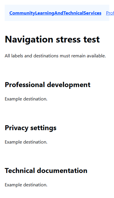
Identify each constraint
In DevTools, inspect the header, brand link, nav wrapper, list and list items. The header's default flex wrapping is nowrap, and the list is another nowrap flex row. The brand and link text explicitly prohibit wrapping. Flex items also have an automatic minimum width, so allowing the outer row to wrap alone does not guarantee that an oversized child can shrink.
Do not hide the overflow or shorten the labels to make this test pass. Those changes conceal destinations or alter the requirement. First remove the layout constraints that prevent the real content from fitting.
Allow both flex levels and the text to adapt
Append this repair block after the existing CSS inside the style element. Keep the original colors, focus rule and HTML:
.site-header { flex-wrap: wrap; }
.brand {
  flex: 1 1 18rem;
  min-width: 0;
  white-space: normal;
  overflow-wrap: anywhere;
}
.site-nav { flex: 2 1 24rem; min-width: 0; }
.links { flex-wrap: wrap; }
.links li { flex: 1 1 10rem; min-width: 0; }
.links a {
  display: block;
  min-height: 44px;
  padding: .5rem;
  white-space: normal;
  overflow-wrap: anywhere;
}
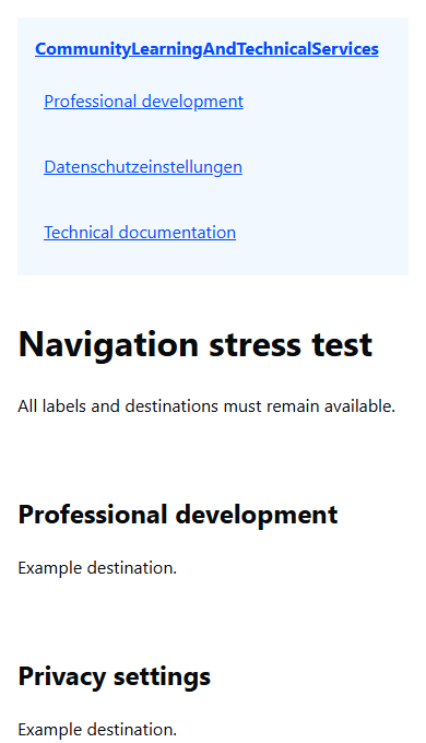
The outer header can now place brand and navigation on separate lines. Their flex bases are preferred sizes, not fixed widths. The nested list can wrap its own items, and min-width: 0 lets the relevant flex items shrink below their automatic content minimum.
white-space: normal restores ordinary text wrapping. overflow-wrap: anywhere gives the unusually long unspaced labels a final break opportunity rather than forcing horizontal overflow. All text remains present; no ellipsis, clipping or fixed header height is required.
Verify content, reflow and focus together
Check at 1440, 1024, 768, 390 and 320px CSS viewport widths. Then increase text size and try 200% browser zoom in a desktop window. Reflow can increase the header's height; let it grow rather than setting a small fixed height.
| Check | Pass condition |
|---|---|
| Long site name and German label | Complete text stays inside the content frame |
| Narrow width or enlarged text | Links wrap without horizontal page scrolling |
| Tab through the header | Brand, development, privacy and documentation links remain reachable |
| Activate each link | Its real in-page destination exists and opens |
| Focus outline and wrapped rows | Visible focus, no overlap or clipped labels |
The links have a 44px minimum height, with padding inside each block. A wrapped label can grow taller. Check the actual boxes and keyboard order, not just whether an overflow scrollbar disappeared.
Locate the remaining source of overflow
- The brand still extends past the edge: check for a later nowrap rule or a fixed/minimum width on that item.
- The nav drops below but its links still overflow: inspect the nested flex list and nav wrapper. Outer wrapping does not repair inner nowrap behavior.
- A long word alone still forces width: verify the text wrapping rule reaches the anchor and the flex item's minimum width can shrink.
- Focus disappears near an edge: remove clipping on ancestors or leave enough padding for the outline; preserve the focus style.
- Zoom makes content overlap: look for fixed heights or positioned layers rather than reducing text size.
Try an incomplete outer-row repair
In a separate copy of the broken page, add only .site-header { flex-wrap: wrap; }. Will that guarantee the long brand and nested links fit on a phone?
Answer: no. The unbreakable brand and nested nowrap list retain their constraints. Inspect those elements after the outer row wraps, then apply the complete repair. The fix belongs to every level that owns a width constraint, rather than one arbitrary breakpoint.
References: flex-item minimum widths and overflow wrapping.
About
Reproduce navigation overflow with long and translated labels, repair nested flex and text constraints, and verify reflow and keyboard access.
Reviews
Sign in to write a reviewComments (0)
Sign in to commentNo comments yet.