

Decide whether the whole image must remain visible before setting its dimensions. An article diagram usually needs its original proportions. A row of product cards may need matching frames. Those are different layout requirements, and the CSS should make the choice explicit.
You will use the same image three times: at its natural ratio, cropped into a wide frame, and fitted inside that frame without cropping. A circle in the test image makes distortion easy to spot.
Prepare a local test image
Open the 800 × 600 test image and save it as ratio-test.svg. Keep it in the same folder as the HTML file you will create below. If it opens in a browser tab, use Save As and keep the SVG extension.
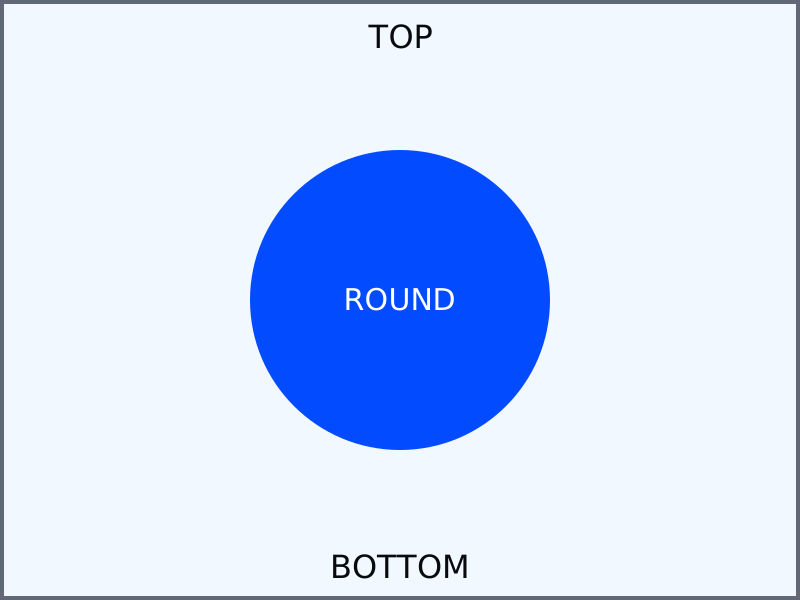
The labels near the top and bottom help you see what gets cropped. The circle should remain round. You can later substitute a photo, but update its width and height attributes to match that file's actual dimensions.
Compare three complete layouts
Save the following as image-ratios.html beside the image, then open it. The example works from local files and does not require a server.
<!doctype html>
<html lang="en">
<head>
  <meta charset="utf-8">
  <meta name="viewport" content="width=device-width, initial-scale=1">
  <title>Keep the image or crop the frame</title>
  <style>
    * { box-sizing: border-box; }
    body {
      margin: 0;
      padding: 1rem;
      font: 1rem/1.6 system-ui, sans-serif;
      color: #080b0e;
    }
    main { max-width: 640px; margin-inline: auto; }
    figure { margin: 1.5rem 0; }
    figcaption { margin-top: 0.5rem; }
    .natural {
      display: block;
      max-width: 100%;
      height: auto;
    }
    .frame {
      width: 100%;
      aspect-ratio: 16 / 9;
      background: #dce3ed;
    }
    .frame img {
      display: block;
      width: 100%;
      height: 100%;
      object-fit: cover;
      object-position: center;
    }
    .frame--contain img { object-fit: contain; }
  </style>
</head>
<body>
  <main>
    <h1>Three ways to display the same 4:3 image</h1>
    <figure>
      <img class="natural" src="ratio-test.svg"
           width="800" height="600"
           alt="Blue circle with TOP and BOTTOM markers">
      <figcaption>Natural ratio: the entire image stays visible.</figcaption>
    </figure>
    <figure>
      <div class="frame">
        <img src="ratio-test.svg" width="800" height="600"
             alt="Blue circle cropped into a wide frame">
      </div>
      <figcaption>Cover: fills a 16:9 frame and crops top and bottom.</figcaption>
    </figure>
    <figure>
      <div class="frame frame--contain">
        <img src="ratio-test.svg" width="800" height="600"
             alt="Whole blue circle image inside a wide frame">
      </div>
      <figcaption>Contain: shows the entire image with space at the sides.</figcaption>
    </figure>
  </main>
</body>
</html>
Measure the natural-ratio image
The first image uses max-width: 100% and height: auto. It can shrink to fit the content column while keeping its 800:600, or 4:3, ratio. The width and height attributes describe the source dimensions and give the browser an aspect ratio before the image finishes loading.
At a 1024px viewport, the example's main column reaches its 640px limit. The first image should measure 640 × 480 CSS pixels. At 390px, the page's 16px padding on each side leaves 358px, so the image should be approximately 358 × 268.5. Fractional dimensions are normal.
Compare cropping with fitting
The other two examples put the image inside a 16 / 9 frame. At 640px wide, that frame is 360px tall. Its image element fills the frame; object-fit controls how the source artwork fits inside the element.
- Cover: fills the frame and preserves the artwork's proportions. Here it crops the top and bottom of the 4:3 source, including the edge labels.
- Contain: preserves the whole source. Here there is unused space on the left and right, showing the frame's background.
- Fill: the default value can stretch artwork when the element's width and height force a different ratio. That is usually unsuitable for a product photo.
A frame and its image are separate boxes. Changing only object-fit does not give an otherwise natural-height image a fixed crop area. Check the element's actual width and height as well.
Fix a stretched photo
Suppose an existing rule sets img { width: 100%; height: 200px; }. If the image should show fully, replace the fixed height with height: auto. If every card needs a consistent crop, use a deliberately sized frame and object-fit: cover. Avoid applying that card rule to every image in an article.
If the image still looks wrong, inspect the winning height and object-fit declarations. If it is missing altogether, check the filename, extension and folder before changing CSS. If a face or label is cropped, adjust object-position or choose containment; important information should not depend on a crop that hides it.
Try a square card
Change the frame ratio to 1 / 1. Predict which edges will disappear in the cover example.
Expected result: a square frame crops the left and right of this landscape source. The circle stays round and the top/bottom markers remain visible. The contain example shows the complete image with unused space above and below. If the circle becomes an oval with a bitmap photo substituted, check for a missing object-fit declaration.
This controls display geometry; it does not reduce a large photo's download size. Continue to srcset and sizes for product images for source selection. For the fitting behavior, see MDN's object-fit reference.
About
Compare natural sizing, cover and contain with one downloadable test image. Measure the result and choose cropping deliberately without stretching the artwork.
Reviews
Sign in to write a reviewComments (0)
Sign in to commentNo comments yet.