

A box declared as 260px wide can occupy 310px before you add any margin. If a card spills out of a column, measure what the width includes before reducing the font or hiding the overflow.
This experiment compares two boxes with identical width, padding and borders. You will calculate their outside widths, measure them in DevTools, and fix an overflow caused by width: 100%. You need a browser and a text editor.
Identify the four layers
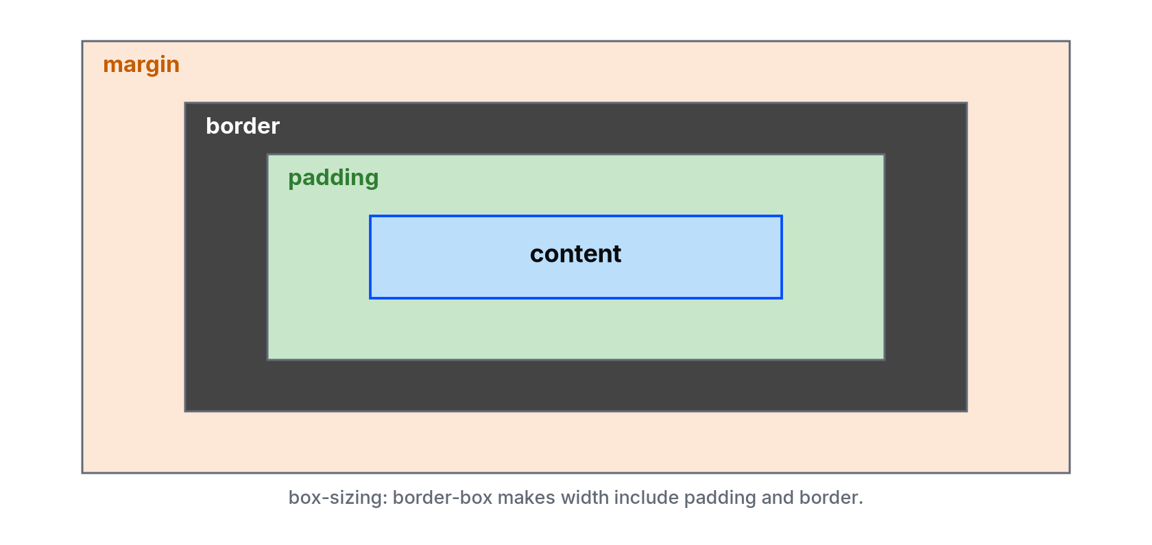
- Content: the space used by text, images or other children.
- Padding: the space between that content and the border.
- Border: the edge around the padded content.
- Margin: space outside the border, separating the box from its neighbours.
For an ordinary block in this example, box-sizing determines whether the declared width covers the content alone or the content plus padding and border. Margin stays outside either measurement.
Make a page you can measure
Save this complete example as box-model.html and open it. Use a browser viewport at least 390 CSS pixels wide for the first measurements.
<!doctype html>
<html lang="en">
<head>
  <meta charset="utf-8">
  <meta name="viewport" content="width=device-width, initial-scale=1">
  <title>Measure two CSS boxes</title>
  <style>
    body {
      margin: 0;
      padding: 16px;
      font: 16px/1.6 system-ui, sans-serif;
      color: #080b0e;
    }
    .track {
      width: 300px;
      max-width: 100%;
      outline: 2px dashed #626976;
    }
    .box {
      width: 260px;
      padding: 20px;
      border: 5px solid #034bff;
      margin: 16px 0;
      background: #f2f8ff;
    }
    .content-box { box-sizing: content-box; }
    .border-box { box-sizing: border-box; }
  </style>
</head>
<body>
  <h1>Same width declaration, different outside widths</h1>
  <p>The dashed track is 300px wide when there is room.</p>
  <div class="track">
    <div class="box content-box">Content-box: measure my blue border.</div>
    <div class="box border-box">Border-box: measure my blue border.</div>
  </div>
</body>
</html>
The first blue box should extend 10px beyond the right edge of the dashed 300px track. The second should fit inside with 40px to spare. The dashed line is an outline: it does not add to the track's layout width.
Calculate the result before inspecting it
Both boxes declare width: 260px, 20px padding on each side and a 5px border on each side. Their horizontal margins are zero.
- Content-box: 260 + 20 + 20 + 5 + 5 = 310px across the outside of the border.
- Border-box: the outside of the border is 260px. Subtract 40px padding and 10px border to get a 210px content area.
The second box has less room for its text, so it may wrap onto more lines. That is an expected consequence of fitting the padding and border inside the same declared width.
Check the numbers in DevTools
- Right-click the first box and choose Inspect.
- Open Computed and find the box model diagram. Confirm a 260px content width, 20px left/right padding and 5px left/right border.
- Inspect the second box. Its content area should be 210px wide, with the same padding and border.
- In the Console, run the following to measure each border box directly.
Array.from(document.querySelectorAll('.box'), box => ({
  sizing: getComputedStyle(box).boxSizing,
  width: box.getBoundingClientRect().width
}));
The returned widths should be 310 and 260. getBoundingClientRect() includes padding and border, but not margin. Keep browser zoom and any DevTools emulation scale in mind when comparing those CSS-pixel values with a physical screenshot.
Reproduce the 100% width mistake
In the .box rule, replace width: 260px with width: 100%. At a 390px viewport, the track is still 300px wide. The content-box now becomes 350px across its border, while the border-box stays 300px.
Restore the original width after checking. For a real component that should fill its parent, keep width: 100% and use box-sizing: border-box. A common page-wide starting rule is:
*, *::before, *::after {
  box-sizing: border-box;
}
This does not include margin in the width. A 100%-wide element with additional horizontal margins can still overflow. Fixed minimum widths, long unbroken text and oversized children can cause separate overflow problems too.
If your measurement differs
Check whether another stylesheet changed box-sizing, padding or border. A transform can also change the rectangle reported by getBoundingClientRect(). Run the supplied file on its own first so a framework's reset does not change the experiment.
Vertical margins between some block elements can collapse, so two 16px vertical margins do not always create a 32px gap. That is a separate behavior from the horizontal width calculations here. Use the browser's measured layout rather than adding vertical margins by assumption.
Predict one change
Restore width: 260px, then change the padding to 30px. Before reloading, calculate the outside and content widths.
Expected result: the content-box border width is 330px; the border-box stays 260px and has a 190px content area. If the result differs, inspect the winning declarations before changing more values.
For another practical diagnosis, continue to fixing horizontal scroll on mobile. See MDN's box-sizing reference for the sizing rules.
About
Measure two boxes with the same declared width, calculate padding and border, and reproduce the 100% width overflow mistake before fixing it.
Reviews
Sign in to write a reviewComments (0)
Sign in to commentNo comments yet.