

If a page scrolls sideways, identify the element extending beyond the available width before hiding anything. A local code example may legitimately scroll inside its own box; the whole page should not have to move sideways to read an ordinary panel.
This local example intentionally starts broken. Save it as overflow.html and open it around 390 CSS pixels wide. You will need to scroll sideways to see the right edge of the delivery panel.
Reproduce one known cause
<!doctype html>
<html lang="en">
<head>
  <meta charset="utf-8">
  <meta name="viewport" content="width=device-width, initial-scale=1">
  <title>Find the oversized child</title>
  <style>
    * { box-sizing: border-box; }
    body {
      margin: 0;
      padding: 16px;
      font: 1rem/1.6 system-ui, sans-serif;
      color: #080b0e;
      background: #ffffff;
    }
    main { max-width: 60rem; margin-inline: auto; }
    body { padding: 0; }
    main { width: min(100% - 32px, 60rem); }
    .hero {
      width: 720px; /* Deliberate bug: wider than a phone. */
      padding: 24px;
      background: #f2f8ff;
      border: 2px solid #034bff;
    }
    pre { max-width: 100%; overflow-x: auto; padding: 12px; }
    p { overflow-wrap: anywhere; }
  </style>
</head>
<body>
  <main>
    <h1>Find the box that is too wide</h1>
    <section class="hero">
      <h2>Delivery update</h2>
      <p>This panel has a fixed width. Repair its width, not the scrollbar.</p>
    </section>
    <p>The command below is allowed to scroll inside its own box.</p>
    <pre tabindex="0" aria-label="Scrollable sample command"><code>python reconcile.py --input warehouse-export.csv --output reconciliation-report.csv --include-archived-orders</code></pre>
  </main>

</body>
</html>
The main wrapper fits the viewport with 16px space on each side. Its child has a fixed 720px width. At a 390px viewport, the parent has 358px available, so that child cannot fit. At a sufficiently wide desktop viewport the same bug is less obvious.
Inspect the edge that escapes
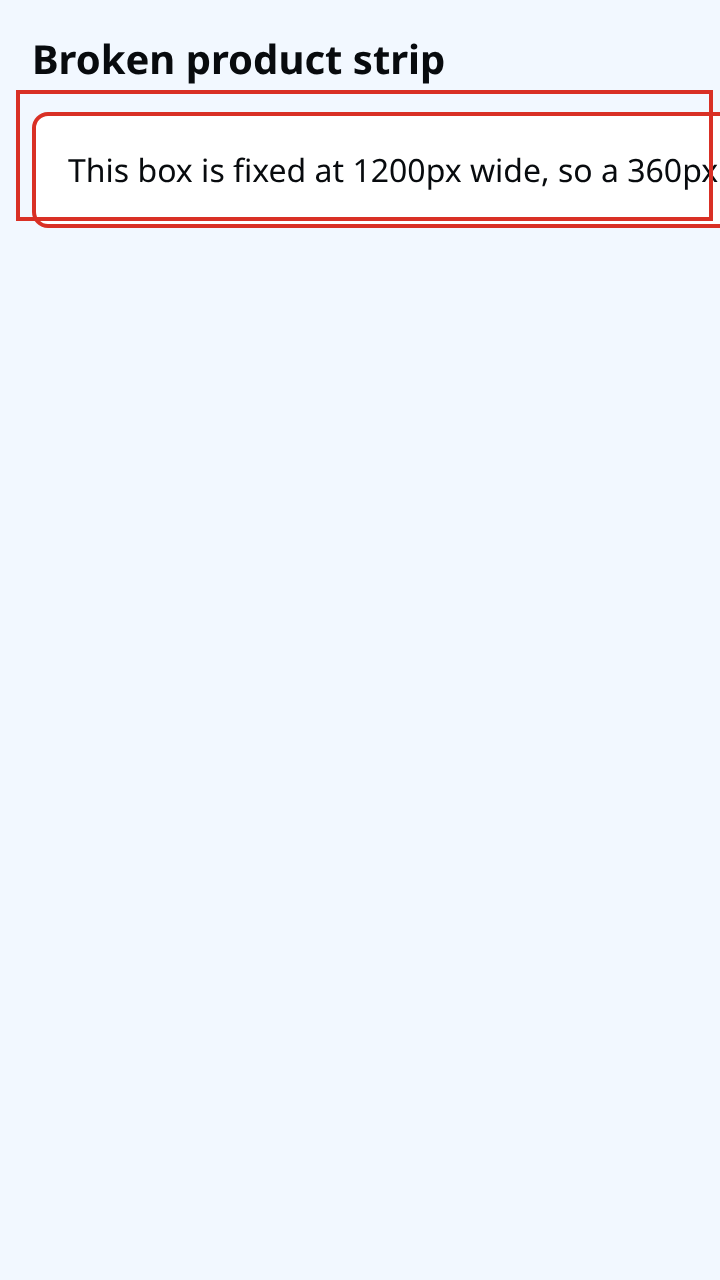
The reference screenshot illustrates the symptom. For your own file, open device emulation or narrow the browser. Select the delivery panel and inspect its width, padding and border. All elements in this example use border-box sizing, so the declared 720px already includes the panel's padding and border.
You can list elements whose rectangles extend outside the viewport with this Console check:
Array.from(document.querySelectorAll('body *')).filter(element => {
  const box = element.getBoundingClientRect();
  return box.right > document.documentElement.clientWidth || box.left < 0;
});
Run it while scrolled fully left. Treat the results as clues: a descendant inside an intentional local scroll area can also extend beyond the viewport in this geometric test. Inspect the ancestor that owns the scrolling instead of changing every returned element.
Repair the available-width assumption
Replace width: 720px in the hero rule with width: 100%. Save, reload and return to the narrow width. The panel should now fit the parent's 358px rather than demand 720px.
The command box still has its own scrollbar when needed. Tab to it and use arrow keys to reach the hidden text. That preserves access to a long line without forcing the rest of the page to overflow. The command is layout sample text; you do not need to run it.
Check other likely causes on a real page
If the width repair is not enough, inspect large images, a min-width on a flex/grid item, unbroken text, or an absolutely positioned decoration. Give responsive images an appropriate maximum width and automatic height; let shrinkable layout items use a zero minimum when their content policy allows it.
A wide embedded player may need an aspect-ratio wrapper instead of an arbitrary height. A deliberately offscreen decorative shape may need local clipping. Choose the rule for the element's purpose rather than applying one global media rule to unrelated image, video and iframe elements.
Verify the document, not just the screenshot
In the Console, compare document.documentElement.scrollWidth with document.documentElement.clientWidth. For the repaired example, they should match. Then resize through intermediate widths and increase browser zoom.
Do not start with body { overflow-x: hidden; }. It can conceal a still-oversized panel, content or focus indicator. If clipping is intentional, keep it local and verify that everything readers need remains reachable.
Introduce a second width problem
After the first fix, give the panel min-width: 500px. Check the page again at 390px, then remove that minimum.
Expected result: overflow returns despite width being 100%, because the minimum constrains shrinking. Removing it restores the fit. Continue to the Grid long-content experiment for a related minimum-size problem.
About
Reproduce a fixed-width overflow on a narrow screen, locate the offending element and verify a repair without clipping the page.
Reviews
Sign in to write a reviewComments (0)
Sign in to commentNo comments yet.