

A main column and sidebar need enough room for their contents, not just two numbers in a Grid declaration. A layout can look fine with short placeholder text and overflow as soon as someone pastes a long identifier or command.
This walkthrough builds a notes page with supporting links. You will check its reading order, reproduce a content-width failure and choose the point where two columns become one. You need a browser and text editor; no framework is required.
Start with the reading order
Put the main content before the supporting information in the HTML. On a narrow screen the sidebar will follow the notes. Keyboard and assistive-technology users should encounter that same meaningful sequence. Avoid using visual reordering to conceal an unsuitable source order.
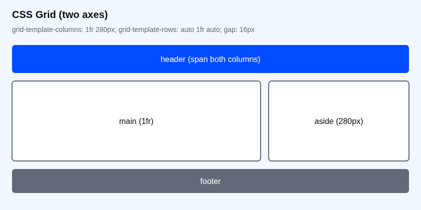
Run the complete page
Save this as two-column-grid.html and open it. The example includes long content on purpose. It should fit the page without requiring horizontal page scrolling.
<!doctype html>
<html lang="en">
<head>
  <meta charset="utf-8">
  <meta name="viewport" content="width=device-width, initial-scale=1">
  <title>A main column and a readable sidebar</title>
  <style>
    * { box-sizing: border-box; }
    body {
      margin: 0;
      font: 1rem/1.6 system-ui, sans-serif;
      color: #080b0e;
      background: #ffffff;
    }
    .shell {
      display: grid;
      grid-template-columns: minmax(0, 1fr);
      gap: 24px;
      width: 100%;
      max-width: 1100px;
      padding: 24px;
      margin-inline: auto;
    }
    .shell > * { min-width: 0; }
    .panel {
      border: 1px solid #dce3ed;
      border-radius: 12px;
      padding: 20px;
      overflow-wrap: anywhere;
    }
    .shell__aside { background: #f2f8ff; }
    pre {
      max-width: 100%;
      overflow-x: auto;
      padding: 12px;
      background: #f2f8ff;
    }
    a { color: #034bff; }
    a:focus-visible { outline: 3px solid #034bff; outline-offset: 3px; }
    @media (min-width: 900px) {
      .shell { grid-template-columns: minmax(0, 1fr) 260px; }
    }
  </style>
</head>
<body>
  <div class="shell">
    <main class="panel shell__main">
      <h1>Project notes</h1>
      <p>Read the notes first, then use the supporting links.</p>
      <p>Long identifiers should wrap inside their own column:</p>
      <p>release_2026_customer_import_validation_and_reconciliation_report_final</p>
      <pre tabindex="0" aria-label="Scrollable command example"><code>python validate_import.py --input customers.csv --report reconciliation-report.csv --strict</code></pre>
      <h2 id="checks">Before delivery</h2>
      <p>Check the report and record unresolved questions.</p>
    </main>
    <aside class="panel shell__aside" aria-label="Supporting information">
      <h2>Related checks</h2>
      <p>Supporting links follow the main notes in reading order.</p>
      <a href="#checks">Go to delivery checks</a>
    </aside>
  </div>
</body>
</html>
At 1024px, the two panels sit side by side. At 768px or 390px, the sidebar moves below the notes. The command can scroll horizontally inside its own box; it should not push the whole page wider. That code is sample text for the layout, not a Python command you need to run.
Understand the column sizes
Above the breakpoint, 260px fixes the sidebar's outer grid track. minmax(0, 1fr) gives the main track the remaining space while allowing it to shrink below its content's automatic minimum. The 24px gap separates the tracks; it is not part of either one.
At a 1024px viewport, the shell's 48px horizontal padding leaves 976px for the tracks and gap. Subtract the 260px sidebar and 24px gap: the main track is 692px. Its panel padding and border sit inside that width because the example uses border-box sizing.
The direct children also have min-width: 0. This lets the items shrink with their tracks. Long prose can wrap through overflow-wrap: anywhere, while preformatted code gets its own scroll area. Each rule addresses a different part of the problem.
Reproduce a content-width failure
- At 1024px, replace the long identifier with a single 200-character word.
- Change the desktop tracks to
1fr 260px. - Remove
.shell > * { min-width: 0; }and the panel'soverflow-wrap: anywhere. - Reload. The long word can force the main track beyond the available space.
- Restore the original tracks, minimum-width rule and wrapping. The word should wrap inside the panel again.
Setting the track minimum to zero allows shrinking; it does not automatically break every kind of content. If a real layout still overflows, inspect children for fixed widths, images larger than their columns, or a minimum width set by another stylesheet. Do not hide page overflow just to conceal the cause.
Choose the breakpoint from the content
This example switches at 900 CSS pixels. At that width, the main track has 568px after padding, gap and sidebar are accounted for. That is a starting choice for these notes, not a universal device breakpoint.
Resize slowly through 899px and 900px, then try longer headings and the text your own sidebar will use. If it feels cramped before the switch, move the breakpoint higher. A wider sidebar also leaves less room for the main track and may require an earlier move to one column.
Check narrow screens and keyboard use
- At 390px, confirm the page fits horizontally and both panels have readable padding.
- Press Tab to focus the command box. Use the horizontal arrow keys to reveal its hidden text.
- Tab to the sidebar link and activate it. It should move to the delivery checks heading.
- Confirm the main notes still precede the sidebar in the HTML. Browser zoom may also trigger the narrow layout by reducing the available CSS-pixel width.
Try a wider sidebar
Change the desktop sidebar track to 300px. At 1024px, predict the main track before inspecting it.
Expected result: the main track is 652px: 1024 − 48 − 24 − 300. At 899px there is still one column because you have not changed the media query. Decide whether the remaining reading space justifies moving that breakpoint.
For grids whose layout should respond to their containing component, continue to container queries for a card. See MDN's minmax reference for the track-sizing syntax.
About
Build a complete main-and-sidebar layout, reproduce long-content overflow, and verify track widths, the mobile breakpoint and keyboard access.
Reviews
Sign in to write a reviewComments (0)
Sign in to commentNo comments yet.