

Your card's outer slot is wide enough for a breakpoint, but its buttons still stack. Before changing the breakpoint, check which ancestor the query measures. Adding a nested container can change the answer without changing the viewport or the outer slot.
This investigation assumes you already know the basic container-type setup. For the first card layout, use the course lesson on component breakpoints. Here we deliberately introduce a second container, reproduce a missed query, and repair its selection.
Reproduce the missed breakpoint
Save this as nested-container.html. Open it in a current browser that supports inline-size container queries. At a 1024px viewport, with the default 16px root font size, the outer slot is 672px wide and the details container is 288px. The intended design uses two button columns when the outer slot reaches 480px, while preserving both actions in a single column below that.
<!doctype html>
<html lang="en">
<meta charset="utf-8">
<meta name="viewport" content="width=device-width, initial-scale=1">
<title>Which container is the query measuring?</title>
<style>
  * { box-sizing: border-box; }
  body { font: 1rem/1.5 system-ui; margin: 0; padding: 1rem; }
  .slot { width: 42rem; max-width: 100%; container: product-slot / inline-size; }
  .card { padding: 1rem; border: 1px solid #c9ced6; border-radius: .75rem; }
  h1 { margin-top: 0; font-size: 1.5rem; }
  .details { width: 18rem; max-width: 100%; container: details / inline-size; }
  .actions { display: grid; gap: .5rem; }
  .actions button { font: inherit; padding: .5rem; }
  @container (min-width: 30rem) {
    .actions { grid-template-columns: repeat(2, minmax(0, 1fr)); }
  }
</style>
<div class="slot">
  <article class="card">
    <h1>Draft proof service</h1>
    <p>Review your document before sending the final version.</p>
    <div class="details">
      <p>Choose a review action. Both actions remain available at every width.</p>
      <div class="actions">
        <button type="button">View draft</button>
        <button type="button">Save copy</button>
      </div>
    </div>
  </article>
</div>
</html>
The buttons intentionally have no application behavior; this is a layout test. The failure is their arrangement. The unnamed query asks for the nearest eligible ancestor of .actions. That is .details, whose width is below 30rem, so the two-column rule does not run.
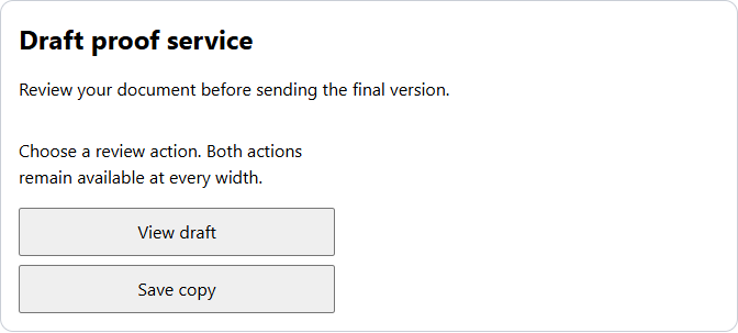
Inspect both ancestors at one viewport
Keep the viewport at 1024px. In DevTools Elements, select .actions and walk up through .details to .slot. Inspect each container's computed name, type and content width. Container highlighting can help, but the selected ancestor and its measured width are the evidence you need.
You can also run this read-only check in the Console. It reports primitive values, so you can compare them before and after the repair:
for (const selector of [".slot", ".details", ".actions"]) {
  const element = document.querySelector(selector);
  const style = getComputedStyle(element);
  console.log(selector, {
    width: style.width,
    name: style.containerName,
    type: style.containerType,
    columns: style.gridTemplateColumns
  });
}
Both containers use inline-size. The names alone do not make an unnamed query choose the outer one. Eligibility and proximity still apply. Also, a query container cannot use its own size query to restyle itself; these rules style descendants.
Name the intended owner
Replace only the query header, keeping its rule body:
@container product-slot (min-width: 30rem) {
  .actions { grid-template-columns: repeat(2, minmax(0, 1fr)); }
}
Now the browser looks for an eligible ancestor named product-slot. It passes the nested details container and measures .slot. At the same 1024px viewport the buttons should form two columns. The details panel stays 288px wide; we changed which width controls the decision, not the width of the controls themselves.
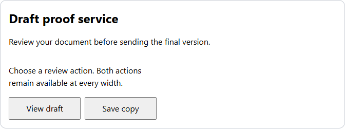
This design deliberately ties the action arrangement to the outer component. If the actions should respond only to their own available width, querying details would be the correct choice. Name the owner that matches the requirement rather than always selecting the outermost box.
Test the boundary without resizing the window
With the repaired rule and a 1024px viewport, edit .slot's width in DevTools. Keep the root font size at 16px for these measurements:
| Slot width | Details width | Expected button columns |
|---|---|---|
| 479px | 288px | One |
| 480px | 288px | Two |
| 672px | 288px | Two |
The inclusive min-width condition switches at exactly 30rem. Next restore 42rem and check a 390px viewport: body padding leaves a 358px slot, so the actions stack again. Check keyboard focus and longer button labels as well. No description or action should disappear to make the layout fit. With a larger default font size, rem-based thresholds move; compare against the computed root font size rather than assuming 480px forever.
If the named rule still does not apply
- No ancestor has that name: check spelling and computed styles. A shorthand declared later may reset the name or type.
- The container is not an ancestor: a nearby sibling cannot be selected by this query.
- The name is reused inside the slot: the nearest eligible ancestor with that same name wins. Give different layout owners different names.
- The rule matches but buttons still stack: inspect the cascade for a later or more specific grid declaration.
- Container queries are unavailable: the base single-column grid remains usable, with both buttons visible.
Try a deliberate name collision
Change .details to container: product-slot / inline-size while leaving the repaired query in place. What happens at the 1024px viewport?
Answer: the buttons stack again. The nearest matching ancestor is now the 288px details container. Restore its distinct details name to recover two columns. A named query removes ambiguity only when the names describe distinct owners.
Reference: MDN @container reference.
About
Reproduce a nested-container breakpoint failure, select the intended named ancestor, and verify the repair at a fixed viewport and at its boundary.
Reviews
Sign in to write a reviewComments (0)
Sign in to commentNo comments yet.