

Container Queries When the Component Is the Breakpoint
Make a component respond to the room it was given instead of the window, and avoid the container traps. After this, one card works in a main column and a sidebar without overrides.
Skip ahead: If you already wrap components in a container-type: inline-size element and know a container cannot style itself, skip to "Common mistakes", then continue.
A media query asks how wide the browser window is. That is the wrong question for a card. The same card sits in a wide main column on one page and a narrow sidebar on another, and the window width says nothing about either slot. A container query asks the question that matters: how much room does this component have?
The smallest version
<div class="slot">
  <article class="card">
    <img src="keyboard.jpg" width="400" height="240" alt="">
    <div>
      <h2>Wireless keyboard</h2>
      <p>Quiet keys, USB-C charging.</p>
    </div>
  </article>
</div>
.slot { container-type: inline-size; container-name: card; }

.card {
  display: grid;
  gap: 0.75rem;
  padding: 1rem;
  border: 1px solid #c9ced6;
  border-radius: 8px;
}

@container card (min-width: 28rem) {
  .card { grid-template-columns: 10rem 1fr; align-items: start; }
}
.slot becomes the container. The @container rule measures .slot, not the window. Below 28rem the card stacks. At 28rem and wider the image moves to the left. The card has no idea where it lives, and it does not need to.
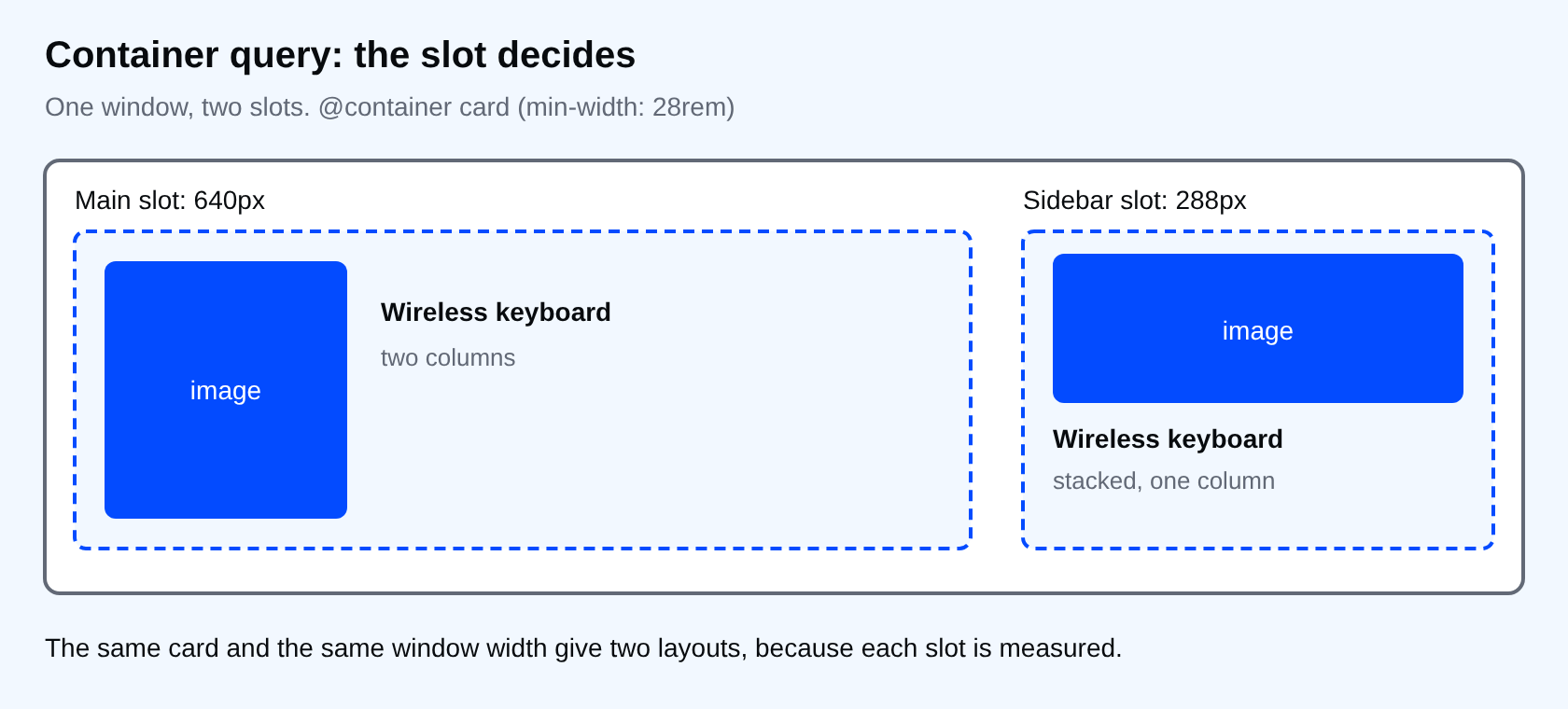
The same card, two slots
I put that card in a main column and in an 18rem sidebar on one page at a 1000px window. Chrome 154 reported the grid as 160px 434px in the main column, where the slot was 640px wide, and 254px, a single column, in the sidebar where it was 288px. One stylesheet, one window width, two layouts.
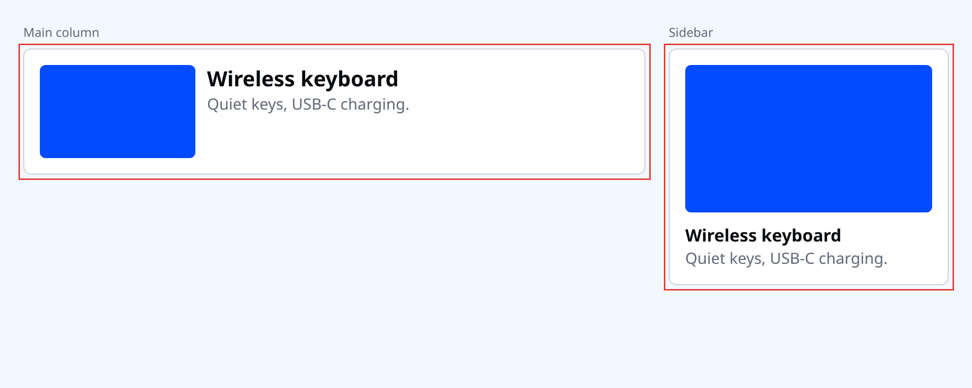
Three rules that catch people
- A container cannot style itself. The query styles descendants only. In my test, a rule inside
@containerthat set the container's own background was ignored, and the child's rule applied. That is why the slot and the card are separate elements. container-type: inline-sizeneeds a width from somewhere. The element behaves as if its content had no width. In a flex row with no width set, my slot measured 0px. Giving itflex: 1 1 20remfixed it, and it measured 556px in an 800px row.- Only size is queried here. Style queries exist, but they are newer. Stay with size until your project needs more.
Where the page still needs a media query
Container queries do not replace page-level decisions. Whether the sidebar sits beside the main column or drops below it depends on the window, so that stays a media query. Inside the slots, the card reacts to the room it was given. Splitting the work this way keeps each rule near the thing it controls: the page decides how big the slots are, the component decides what to do with them.
Units that follow the container
cqi is 1% of the container's inline size. font-size: clamp(1rem, 4cqi, 1.5rem) gives a card heading that scales with the slot, not the window.
⚠ Warning: Do not wrap every element in a container. Each one is a layout boundary that you have to reason about. Add one at the place where a component meets a layout, such as a card slot or a widget in a sidebar.
Common mistakes
- Putting
container-typeon the same element you are trying to restyle. - Using a media query for the component and a container query for the page, which is backwards.
- Naming every container
container. Name them for the component, so@container cardreads clearly.
💡 Tip: Keep a media query for page-level decisions, such as the sidebar moving below the main column. Use container queries for what happens inside a slot.
What happens if you skip this
You write .sidebar .card and .main .card overrides, then .footer .card. Every new place the card appears needs another override, and the card stops being a component.
Try it
Build the card above. Drag the browser window narrower, then move the card into a sidebar. Check that it switches layout based on its slot, not the window.
Where is a component in your project that looks wrong in exactly one of its slots?
About
Make a component respond to the room it was given instead of the window, and avoid the container traps. After this, one card works in a main column and a sidebar without overrides.
Comments (0)
Sign in to commentNo comments yet.