

Critical CSS and What Blocks First Paint
Understand why a stylesheet delays the first paint, inline what the first screen needs, and load the rest without blocking. After this, you can measure the difference in the browser.
Skip ahead: If you already know why a stylesheet in <head> delays the first paint and how media="print" with an onload swap avoids it, skip to "What I measured", then continue.
The browser will not paint anything until it has the CSS it found in the head. That is by design: painting first and styling later would flash raw HTML at every visitor. The price is that a slow stylesheet delays the whole page, even if the first screen needs only a few of its rules. Critical CSS is the fix: put the rules the first screen needs in the HTML, and load the rest without blocking.
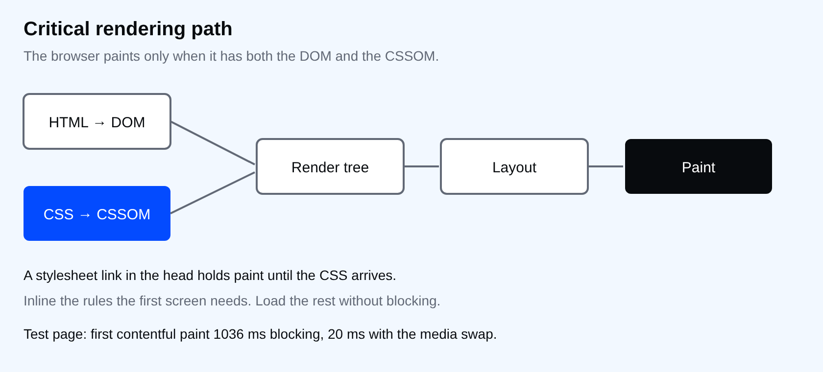
What blocks and what does not
- A
<link rel="stylesheet">in the head blocks rendering until it loads. - A
<link>whosemediadoes not match the current device does not block rendering. The file still downloads, at a lower priority. - A
<style>block in the head costs nothing extra to fetch, since it arrives with the HTML.
The pattern
<head>
  <style>
    /* only what the first screen needs */
    body { font-family: Arial, sans-serif; margin: 0; }
    .hero { padding: 48px 24px; background: #034bff; color: #fff; }
  </style>

  <link rel="stylesheet" href="app.css" media="print" onload="this.media='all'">
  <noscript><link rel="stylesheet" href="app.css"></noscript>
</head>
The media="print" makes the browser treat the file as irrelevant for the screen, so it does not block. When it finishes loading, onload switches the media to all and the styles apply. The noscript copy is for visitors without JavaScript.
What I measured
I served app.css from a local server with a one-second delay and loaded two pages in Chrome 154. One used a plain <link rel="stylesheet">. The other used the pattern above. I read the first contentful paint and the resource's render-blocking status from the browser itself.
blocking   {"fcp": 1036, "css": [{"status": "blocking", "ms": 1017}], "media": ""}
critical   {"fcp": 20, "css": [{"status": "non-blocking", "ms": 1015}], "media": "all"}
First contentful paint went from 1036 ms to 20 ms. The stylesheet itself still took the same second to arrive in both runs. What changed is that the page no longer waited for it. A local server with a fake delay is not your production network, so treat the exact numbers as an illustration and measure your own pages.
The catch
In the test page the cards and the footer had no styles until app.css arrived. That is the trade. You choose what the first screen shows, and everything else may appear plain for a moment. If that flash is worse than the delay, your critical set is too small, or the whole stylesheet is small enough that it should simply stay blocking.
⚠ Warning: Inline event handlers like onload="..." are blocked by a strict Content Security Policy. If your site sets one, load the swap from a script with a nonce, or use a build tool that handles it.
Common mistakes
- Inlining the whole stylesheet and shipping it again as a file. The HTML grows on every page view and the cache cannot help.
- Guessing the critical set. Check what the first screen uses at phone and desktop widths, since they differ.
- Forgetting the
noscriptfallback, then wondering why some visitors see raw HTML. - Treating this as the first optimisation. Compress, cache and trim unused CSS first. A very small stylesheet does not need this.
💡 Tip: Keep the critical block short enough to read in one scroll. If you cannot explain every rule in it, it has grown too big.
What happens if you skip this
On a slow connection the visitor stares at a blank page while the browser waits for rules that the first screen mostly does not use. They do not know why. They only know it was slow.
Try it
Throttle your network in DevTools to a slow preset and reload your homepage with the Performance panel recording. Find the stylesheet request and see when the first paint happens relative to it.
How many of the rules in that file does the first screen actually use?
About
Understand why a stylesheet delays the first paint, inline what the first screen needs, and load the rest without blocking. After this, you can measure the difference in the browser.
Comments (0)
Sign in to commentNo comments yet.