

A breakpoint should change a layout when its content needs a different arrangement. A familiar phone model or a copied device preset does not tell you whether your own headings and controls still fit.
This experiment starts with one column and switches to three at 720 CSS pixels. That number is a testable starting choice, not a recommended size for every website. Save the file as plan-breakpoint.html.
Run a layout with a visible width readout
<!doctype html>
<html lang="en">
<head>
  <meta charset="utf-8">
  <meta name="viewport" content="width=device-width, initial-scale=1">
  <title>Choose a content breakpoint</title>
  <style>
    * { box-sizing: border-box; }
    body {
      margin: 0;
      padding: 16px;
      font: 1rem/1.6 system-ui, sans-serif;
      color: #080b0e;
      background: #ffffff;
    }
    main { max-width: 60rem; margin-inline: auto; }
    .plans {
      display: grid;
      grid-template-columns: minmax(0, 1fr);
      gap: 16px;
    }
    .plan { padding: 16px; border: 1px solid #dce3ed; overflow-wrap: anywhere; }
    .plan h2 { line-height: 1.25; }
    @media (min-width: 720px) {
      .plans { grid-template-columns: repeat(3, minmax(0, 1fr)); }
    }
  </style>
</head>
<body>
  <main>
    <h1>Plans stay readable before they sit side by side</h1>
    <p><output id="width"></output></p>
    <div class="plans">
      <article class="plan"><h2>Starter</h2><p>For a small collection of pages.</p></article>
      <article class="plan"><h2>Growing team</h2><p>For several people maintaining content together.</p></article>
      <article class="plan"><h2>Custom workflow</h2><p>For a process that needs its own review.</p></article>
    </div>
  </main>
  <script>
    const query = matchMedia('(min-width: 720px)');
    function describeWidth() {
      document.querySelector('#width').textContent =
        innerWidth + ' CSS px; ' + (query.matches ? 'three columns' : 'one column');
    }
    addEventListener('resize', describeWidth);
    describeWidth();
  </script>
</body>
</html>
The readout reports the current CSS viewport width and the result of the same query used in the stylesheet. The base rule supplies one column. The min-width condition includes 720px, so the three-column rule applies at that width and above.
Check both sides of the boundary
- Use DevTools responsive mode to set a viewport of 719px. Confirm that the three cards stack.
- Change it to 720px. They should sit side by side.
- Try 768px and 1024px, then narrow to 390px.
- Resize slowly between those points instead of judging only the saved presets.
At 720px, body padding leaves 688px for the grid. Two 16px gaps leave 656px for the three tracks, or approximately 218.7px each. Card padding and borders are inside those tracks. That gives you a concrete reading width to judge, not just a claim that the columns “fit”.
Replace the placeholder content
Change the middle heading to “A growing team with several review stages” and add a longer description. Does the arrangement remain comfortable at 720px? Text can wrap without causing overflow and still produce an awkward result.
If the cards are too cramped, raise the breakpoint or consider a two-column intermediate arrangement. If the content remains useful earlier, you may choose a lower boundary. Keep the source order meaningful and reflow primary information rather than hiding it to make a width test pass.
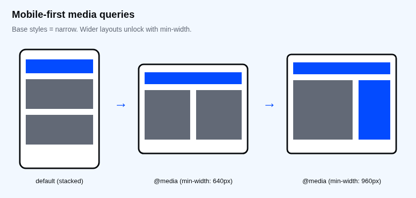
Measure the viewport you are styling
The viewport meta tag tells mobile browsers to use the device-width layout viewport. Width queries use CSS pixels, not the physical pixel count printed on a phone's specifications. Browser zoom can change the available CSS-pixel width and trigger the same query.
The JavaScript readout is a diagnostic aid, not a replacement layout engine. Remove it from a finished design if it has no purpose for visitors. Keep the media query in CSS and use the browser's computed styles to verify which rule currently applies.
Investigate a query that appears ignored
Check that the stylesheet loaded, the selector matches and the viewport is on the expected side of the boundary. Then look for a later matching rule that overrides the column definition. An active query can still lose in the cascade.
A viewport query cannot know how narrow one card's slot becomes inside another layout. Use a container query when the component's own available space is the relevant condition. Avoid assuming every independent component must switch at the same width, though a small documented set of shared breakpoints is easier to maintain.
Move the boundary and verify it
Change both occurrences of 720px to 800px: one in CSS and one in the diagnostic script. Test 799px and 800px.
Expected result: one column at 799px, three at 800px, and a readout that agrees. If the text reports three while the cards still stack, compare the two query strings. For a component-level alternative, continue to container queries for a card.
About
Choose a breakpoint by testing real card content, compare 719px with 720px and distinguish CSS viewport width from device resolution.
Reviews
Sign in to write a reviewComments (0)
Sign in to commentNo comments yet.