

CSS Grid When Flexbox Isn't Enough
Place content in two axes with Grid, name areas when it helps, and pick Grid over Flexbox for page frames. After this, you stop nesting five flex wrappers for a simple two-column page.
Skip ahead: If you already define grid-template-columns, place items with grid-column, and know when to prefer Grid over Flexbox, skip to "Named areas when the sketch is clear", then continue.
Flexbox lines things up on one axis. Page frames usually need two: columns and rows at once. That is Grid. Nesting flex containers until a sidebar appears is how intermediate stylesheets get hard to read.
A two-column page without the flex pyramid
<div class="page">
  <header class="page__header">Store</header>
  <main class="page__main">Product list</main>
  <aside class="page__aside">Filters</aside>
  <footer class="page__footer">© Shop</footer>
</div>
.page {
  display: grid;
  grid-template-columns: 1fr 280px;
  grid-template-rows: auto 1fr auto;
  gap: 1rem;
  min-height: 100vh;
}

.page__header { grid-column: 1 / -1; }
.page__main   { grid-column: 1; grid-row: 2; }
.page__aside  { grid-column: 2; grid-row: 2; }
.page__footer { grid-column: 1 / -1; }
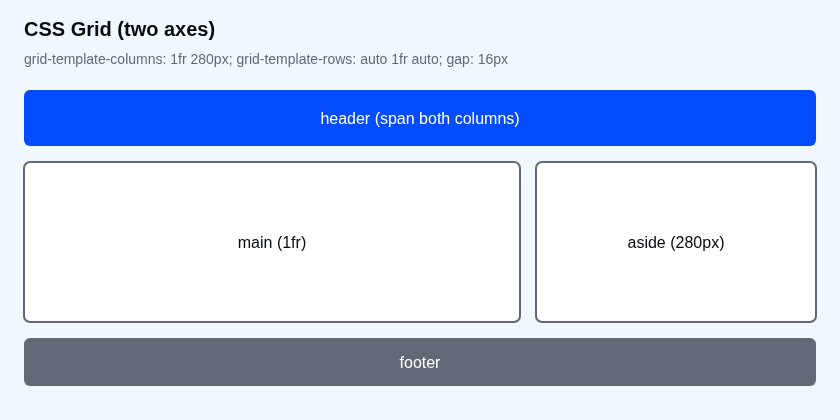
1fr 280px means the main column eats leftover space and the aside stays about 280px. 1 / -1 spans from the first line to the last. You did not nest three wrappers to fake a header that spans both columns.
Fr units, minmax and auto-fit
.gallery {
  display: grid;
  grid-template-columns: repeat(auto-fit, minmax(220px, 1fr));
  gap: 1rem;
}
minmax(220px, 1fr) says each track is at least 220px and can grow. auto-fit collapses empty tracks so fewer columns appear on a narrow screen. That is often enough responsive behaviour without a media query.
Named areas when the sketch is clear
.page {
  display: grid;
  grid-template-areas:
    "header header"
    "main   aside"
    "footer footer";
  grid-template-columns: 1fr 280px;
}
.page__header { grid-area: header; }
.page__main   { grid-area: main; }
.page__aside  { grid-area: aside; }
.page__footer { grid-area: footer; }
Named areas match a wireframe. On a phone, change the template:
@media (max-width: 639px) {
  .page {
    grid-template-areas:
      "header"
      "main"
      "aside"
      "footer";
    grid-template-columns: 1fr;
  }
}
Prefer mobile-first (min-width) in new work. The max-width example above is only to show the area rewrite clearly.
Flex vs Grid in one table
| Job | Prefer |
|---|---|
| Nav links in a row | Flexbox |
| Equal-height cards in a wrapping row | Flexbox or auto-fit Grid |
| Page frame: header / main / sidebar / footer | Grid |
| Centring one box in a viewport | Flexbox (or Grid with one cell) |
💡 Tip: In Chrome DevTools, select a grid container and turn on the Grid overlay. Track numbers stop being imaginary once you can see them.
Common mistakes
- Using Grid for a three-link nav. Flex is simpler.
- Fixed pixel columns only. Phones will overflow. Mix
fr,minmaxand media queries. - Forgetting gap includes gutters. You do not need extra margin on every cell.
What happens if you skip this
You will keep wrapping flex inside flex inside flex until the HTML no longer matches the layout. The next person (or you, in six months) will not know which wrapper is load-bearing.
Try it
Build the two-column page. Shrink the viewport. When 280px + content no longer fits, switch to one column. Ask yourself: did you need five wrappers, or one grid?
When your sketch has rows and columns at the same time, why are you still reaching for flex first?
About
Place content in two axes with Grid, name areas when it helps, and pick Grid over Flexbox for page frames. After this, you stop nesting five flex wrappers for a simple two-column page.
Comments (0)
Sign in to commentNo comments yet.