

Flexbox for Real Rows and Columns
Align items in a row or column with Flexbox, control wrap and gap, and stop reaching for float when you need a toolbar or card row. After this, one-dimensional layouts stop being a fight.
Skip ahead: If you already use display: flex, gap, justify-content, align-items and flex-wrap without guessing, skip to "When flex is the wrong tool", then continue.
Floats were for wrapping text around images. Using them for toolbars and card rows is why half the internet still clears floats. Flexbox is for one direction at a time: a row of nav links, a column of stacked panels, a button group. Learn that, and you stop nesting floats inside clearfixes.
The smallest useful flex container
<header class="topbar">
  <a class="logo" href="/">Shop</a>
  <nav class="nav">
    <a href="/catalog">Catalog</a>
    <a href="/cart">Cart</a>
    <a href="/help">Help</a>
  </nav>
</header>
.topbar {
  display: flex;
  align-items: center;
  gap: 1rem;
  padding: 0.75rem 1rem;
  background: #080b0e;
  color: #f2f8ff;
}

.nav {
  display: flex;
  gap: 1rem;
  margin-left: auto;
}

.nav a { color: #f2f8ff; text-decoration: none; }
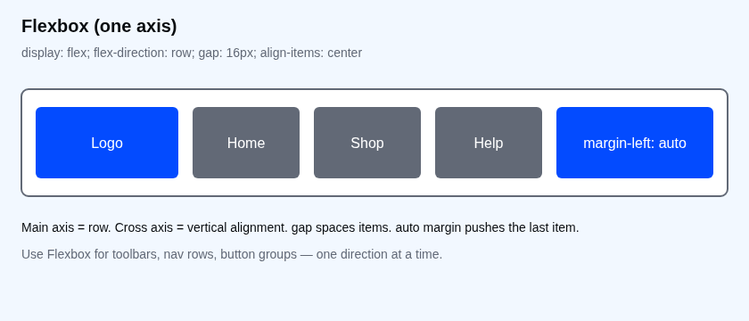
display: flex makes .topbar a flex container. Its children (logo and nav) become flex items on the main axis (row by default). align-items: center centres them on the cross axis. margin-left: auto on the nav eats leftover space on the left, which pushes the links to the right. That is the toolbar pattern.
Direction, wrap and gap
.row { display: flex; flex-direction: row; gap: 16px; }
.col { display: flex; flex-direction: column; gap: 12px; }
.cards {
  display: flex;
  flex-wrap: wrap;
  gap: 1rem;
}
.card { flex: 1 1 220px; }
- row / column — pick the main axis.
- wrap — allow items to move to the next line when they do not fit.
- gap — space between items. Prefer gap over margin on every child.
- flex: 1 1 220px — grow, shrink, and start around 220px. Cards fill the row and wrap when the viewport is narrow.
Justify and align without memorising every value
| Goal | Property |
|---|---|
| Space items along the row | justify-content: space-between or gap + auto margins |
| Centre on the main axis | justify-content: center |
| Centre on the cross axis | align-items: center |
| Stretch children to equal height | align-items: stretch (default for row) |
You do not need every keyword on day one. Measure in DevTools: select the flex container, open the Flex badge in Chrome, and watch how items sit.
Common mistakes
- Using float for a horizontal nav. Clearfix forever. Use flex.
- Setting a fixed height and wondering why text spills. Flex does not invent overflow rules. Add
min-height: 0on nested flex children that must scroll, or let the container grow. - Nesting five flex wrappers for a page frame. That is usually Grid. Flex is one axis.
⚠ Warning: Do not remove focus styles from flex nav links to make the bar look cleaner. Keyboard users need to see which link is focused. Style :focus-visible instead of deleting outline.
When flex is the wrong tool
If you need a sidebar beside a main column and a footer that spans both, you are controlling two axes. That is Grid. If you need text to wrap around an image, float (or a modern float alternative) still has a place. Flexbox for everything is how people invent flex-direction pyramids.
💡 Tip: Put gap on the container. Put sizing on the items (flex, width, min-width). If you find yourself setting margin on every child to fake a gap, stop and use gap.
What happens if you skip this
You will keep clearing floats, fighting vertical alignment with padding hacks, and copying Stack Overflow snippets that set position: absolute on a logo. The layout will look fine on your laptop and fall apart the first time someone adds a fourth nav link.
Try it
Build the topbar above. Resize the window until the links wrap or crowd. Then add flex-wrap: wrap on .topbar and decide whether wrapping or a narrow-screen menu is the better product choice. Measure, then choose.
Which is more honest for your next page: a flex toolbar, or a grid page frame?
About
Align items in a row or column with Flexbox, control wrap and gap, and stop reaching for float when you need a toolbar or card row. After this, one-dimensional layouts stop being a fight.
Comments (0)
Sign in to commentNo comments yet.