
Responsive Layout With Media Queries That Make Sense
Write media queries that match real widths, change layout at clear breakpoints, and avoid one query per pixel. After this, the page adapts on purpose instead of by accident.
Skip ahead: If you already write mobile-first min-width queries tied to your content, not cargo-cult breakpoints, skip to "Pick breakpoints from the design", then continue.
A media query is not a personality. It is a condition: when the viewport is at least this wide, apply these rules. Most "responsive" bugs come from copying 768px and 1024px forever, or from writing desktop styles first and fighting phones with max-width patches.
Mobile-first baseline
.cards {
  display: grid;
  grid-template-columns: 1fr;
  gap: 1rem;
}

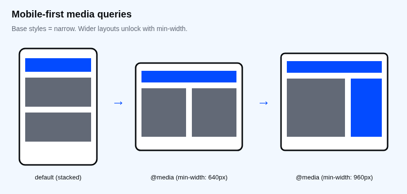
@media (min-width: 640px) {
  .cards { grid-template-columns: 1fr 1fr; }
}

@media (min-width: 960px) {
  .cards { grid-template-columns: 1fr 1fr 1fr; }
}
Narrow screens get one column with no query. Wider screens unlock more columns. You add behaviour as space appears, instead of subtracting it.
Pick breakpoints from the design
Open the page. Slowly widen the window. When the layout looks wrong (line lengths too long, nav crowded, sidebar crushed), note that width. That number is your breakpoint, not a device catalog.
Common starting points that still need checking against your content:
| Rough range | Typical use |
|---|---|
| 640px | Two columns become comfortable |
| 960px | Sidebar beside main |
| 1200px | Cap content width with a centred shell |
Numbers are examples. Your product page may break at 712px. Use 712px then.
What belongs inside a query
- Layout tracks (columns, rows, flex-direction)
- Spacing that only works at that width
- Showing or hiding a desktop-only control (sparingly)
What usually does not: changing the brand colour, rewriting typography wholesale, or forking the entire stylesheet.
⚠ Warning: Prefer min-width for new CSS. A pile of max-width overrides on a desktop-first sheet is how phones inherit rules you forgot to undo.
Common mistakes
- One query per component with different widths. Align breakpoints across the site or you will never remember them.
- Testing only with device presets. Drag the window. Presets miss your awkward middle widths.
- Hiding content on mobile that users still need. Collapse the chrome, do not delete the task.
Prefer features over devices when you can
.sidebar {
  display: none;
}

@media (min-width: 960px) {
  .sidebar { display: block; }
}
You are reacting to space, not to “is iPad”. Device lists go stale. Width queries tied to your layout stay useful.
Container queries (preview)
Modern CSS also has container queries (@container) so a card can adapt to its slot, not the whole viewport. You will use those more in Advanced. At Intermediate, solid viewport min-width queries and Grid/Flex already fix most phone breakage.
Print and other media
@media print {
  .site-nav, .btn { display: none; }
}
Print is another media type. Mention it so you remember media queries are not only about phones.
What happens if you skip this
You will ship a layout that looks fine on your monitor and your phone case, then fail on a 400px-wide Android browser and a 900px tablet in landscape. Support will call it "random".
Try it
Take a three-card row. Start at one column. Add a min-width query only when two cards fit without feeling crushed. Write down the width you actually used.
If your breakpoint came from a blog post instead of your layout, whose screen are you designing for?
About
Write media queries that match real widths, change layout at clear breakpoints, and avoid one query per pixel. After this, the page adapts on purpose instead of by accident.
Comments (0)
Sign in to commentNo comments yet.